
A general and vascular surgery clinic in Tucson was seeing about 30 percent fewer new patients than before. The owner asked me a direct question: is the website part of the reason?
My answer was that I did not know yet, and that anyone who says yes or no before looking is guessing. So I audited it. Not a design review, not an SEO report. An audit of one thing: does this website turn the people who visit it into people who call?
Why I audit in the order a visitor experiences the site
Most website audits come in two flavors. A design audit tells you the site looks dated. An SEO audit tells you the rankings could be better. Both can be true and neither answers the owner’s question, because a website earns its keep at one moment: when a visitor decides to call, book or leave.
So I split the audit into five sections and put them in the order a visitor meets them. What they see when the site opens. What they can and cannot do on it. What the words tell them. What is broken behind the scenes. And what the clinic’s own numbers say about all of it. Each section has one question I am trying to answer for the owner, and every finding has to connect back to a call that did or did not happen.
Before any of that, I pulled the five numbers that frame the whole thing.
More people are arriving. They are doing less when they get there. And the one number that would settle the question has never been collected.
What a visitor sees when the site opens
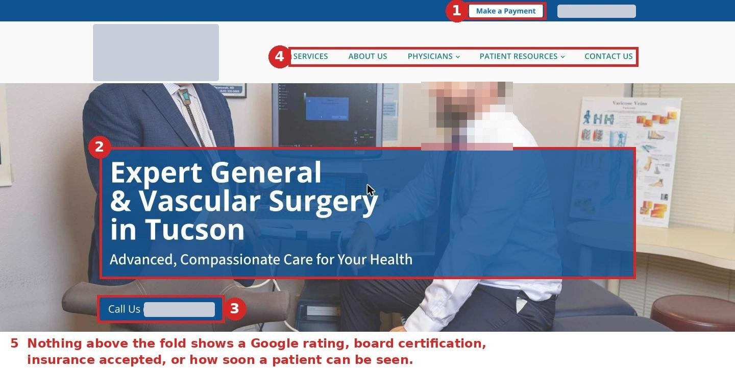
Most of this clinic’s leads come from a doctor’s referral. Before they call, they look the clinic up, almost always on a phone. So I opened the site the way they would and wrote down what the first screen showed: a logo, a stock-looking photo, and a headline about the clinic. No star rating. No board certification. No insurance information. No way to book.
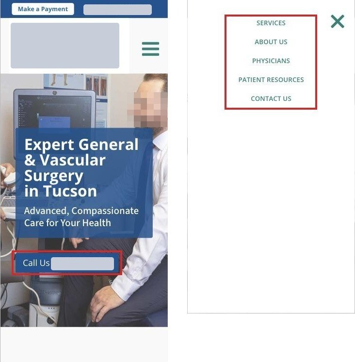
The biggest button on every page was Make a Payment. The only other thing to click was a phone number, and on a phone it disappeared as soon as the visitor scrolled. The reviews on the home page were pulled in automatically from Google, years old, and one of them was a complaint.
First screen on a phone

First screen on a computer, annotated
I also put the phone screen next to a national vascular clinic’s. Theirs opens with the conditions it treats, a booking button beside the phone number, and both stay on screen while you scroll. That comparison is not about taste. It is about what a visitor can do in the first five seconds.
What a visitor tries to do, and where the site stops them
I tried each of those six things on the phone version and the computer version, and then checked what Google Analytics said real visitors did. Three findings carried the section.
First, every button on the site, including “Schedule an Appointment,” was a link that dials the phone. That works on a phone. Two out of three visitors were on a computer, where clicking it does nothing or opens a pop-up asking which app should place the call.
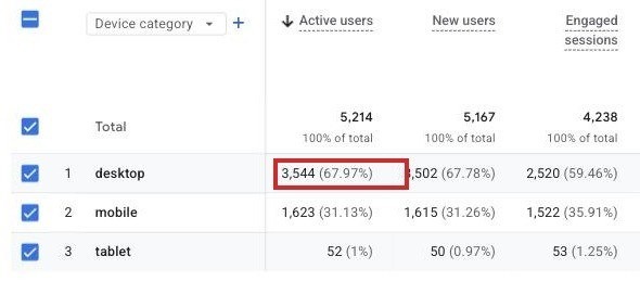
Second, the phone is answered 36 hours a week. The website is visited all 168. At 7 pm, on a Friday afternoon, or on a weekend, every button leads to a phone nobody is picking up, and there is no form, no email address, and nothing that says what happens if you call after hours.
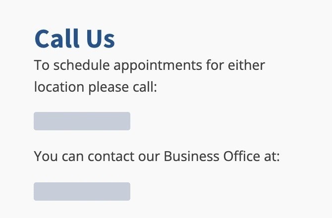
The contact page
The phone menu
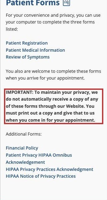
Third, new patients were told to print the forms and bring them in. The forms page opens by telling a phone visitor to use their computer, then explains that nothing sent through the website reaches the clinic. Most homes no longer have a printer. So the first thing the clinic asks a new patient to do is something the website cannot help with.
What the words tell a reader who is still deciding
I keep a list of ten things a lead needs from a site before they call, and I score every page against it. Then I put each score next to what visitors did on that page, this year against last. The site fell short on eight of the ten.
The pattern was consistent. The headline named a specialty and a city and asked nothing of the reader. The services were written in a surgeon’s language, a 120-word paragraph listing organs, and one description was copied word for word under two different headings. The real reasons to choose this clinic, board certification, fellowship training, university teaching, general and vascular surgery under one roof, all existed. They were buried inside the surgeon biographies, not on the page where a person decides.
And the numbers matched the words. Time on the services page, where someone decides whether the clinic treats their condition, fell by a third in a year. The FAQ page, one of the most-read pages on most medical sites, held people for 24 seconds, about the time it takes to read six question titles and leave. Three of the six questions were about fees, and two pages gave two different fees for the same form.
What is broken between the visitor and the front desk
I checked the site from inside WordPress as an administrator, on a phone-sized screen, with Google’s speed test, and by looking up what Google has on file for it. I was not looking for everything that could be improved. I was looking for the places where a person who had already decided to call or visit got stopped.
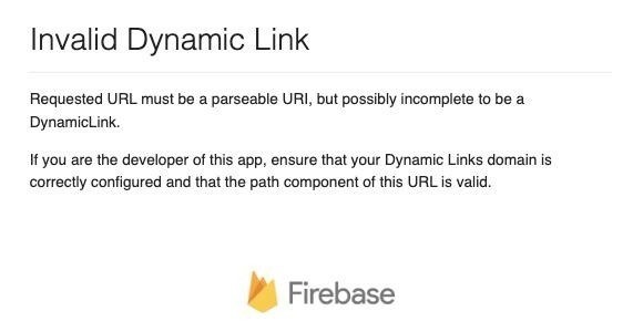
There were three. The business office phone number on the contact page dialed the scheduling line instead, so billing and records calls landed with the scheduling staff. The Get Directions button for the main office opened an error page instead of a map. And any old or mistyped web address landed on a blank page with two headers, two footers and no message. Two hundred forty-seven people ended up there in a year.
Behind those, the condition of the site explained why nobody had caught them. The Contact, Forms and Hospital Affiliations pages carried a setting that tells Google not to show them, so a search for the clinic’s phone number could not bring up the contact page. The tool the whole site is built with was seven versions out of date and set to update itself, untested, in two days. There were no backups, no security plugin, no privacy policy on a site that stores patient names, and the site scored 63 out of 100 for speed on a phone. None of it needed a redesign. All of it was either costing a lead or putting the clinic at risk.
What the clinic’s own numbers say
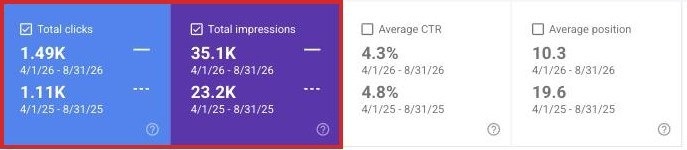
By the numbers most people look at, the website was doing fine. Compared with the same five months a year earlier, it showed up in Google 51 percent more often, got 34 percent more clicks, and moved up in the results. If the clinic had looked only at this, nothing would have seemed wrong.
The numbers tied to new business went the other way. Time on the contact page down 21 percent. Time on the services page down 33 percent. Form downloads down 49 percent. The one thing the site had ever counted, payments through an old form, went to zero in June 2025 when the form was removed and nothing replaced it.
And the number that would have settled the owner’s question, phone calls from the website, had never been counted at all. Google Analytics only counts what someone tells it to count. Nobody had told it anything.
Google Tag Manager, the control panel for what gets counted

Google Analytics, 17 months, the column where calls would be

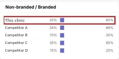
The last thing I checked was who the visitors were. Four out of five people who reached the site from Google had typed the clinic’s name or a surgeon’s name. They already knew where they were going. The people who did not, the ones searching for a vascular surgeon or a hernia repair in the city, were shown the site 23,100 times over 16 months and clicked it 108 times. One click for every 214 times it appeared.
Search Console, searches for a surgeon or a procedure

Semrush, share of Google visitors who searched by name
What I could not prove, and said so
An honest audit has to say where it stops. This one could not prove the website caused the 30 percent drop. The site had never counted a call, so there was no before to compare against. And a home page review praised a surgeon who no longer appeared on the site. If a surgeon left the clinic, that alone could account for a lot of the drop, and it has nothing to do with the website.
So the audit ended with a list of questions only the clinic could answer: how the 30 percent was measured, whether a surgeon had left, what the front desk’s own count of new-patient calls looked like this year against last, and what happens to a call that comes in after 3 pm on a Friday. Those answers decide how much of the drop belongs to the website. Handing an owner that list is more useful than handing them a certainty I do not have.
What happens next
Everything the five sections found went into one list, ordered by how much it affects leads. Fifteen items. I grouped them by how long they take, because a clinic needs a small yes before a big one, and because half of this list is one-line fixes that should not wait for a redesign.
This week
- Repair the phone link that dials the wrong line
- Fix the Get Directions button
- Let Google show the contact and forms pages
- Forward the old pay-online address
- Turn off the untested auto-update
This month
- Count phone taps, form requests and directions clicks, by page
- Add a short appointment request form beside every phone number
- Replace the automatic review feed with chosen reviews and a rating
- Forms that can be typed into and sent
The project
- Rewrite the first screen around the conditions treated, with a request button beside the number
- A page for each condition in plain language
- A page for each surgeon with a request button
- A page for the doctors who refer patients
That last column is where the team comes in. I did the audit alone, because an audit is one person asking the same question of every page. The fix is not. A designer rebuilds the first screen. A developer wires up the tracking, the forms and the redirects. A content writer turns a surgeon’s paragraph into a page a patient can read. My job is to make sure every one of those pieces is measured against the same thing the audit was: does it produce a call that the clinic can count.